Monet - Event Poster
STCC // GAT-225 - Assignment #4
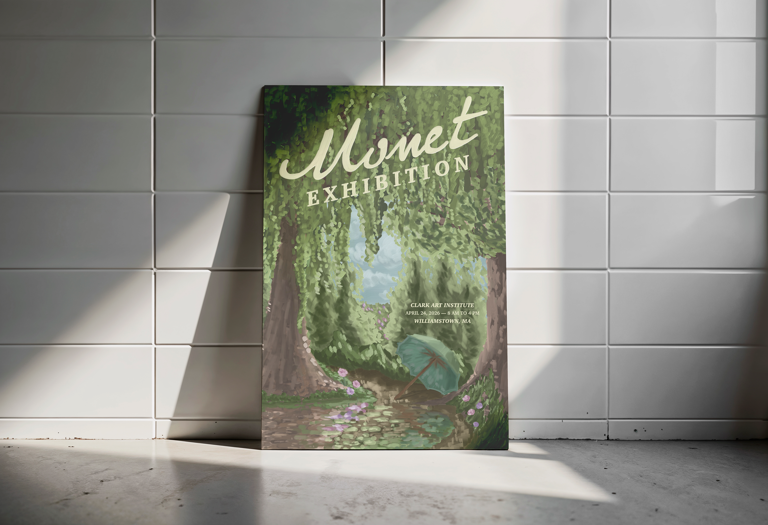
For this project, I designed an event poster inspired by Claude Monet's work, focusing on his ability to capture light, color, atmosphere, and nature. I’ve always been drawn to how his paintings feel less like exact, pristine scenes and more like memories.
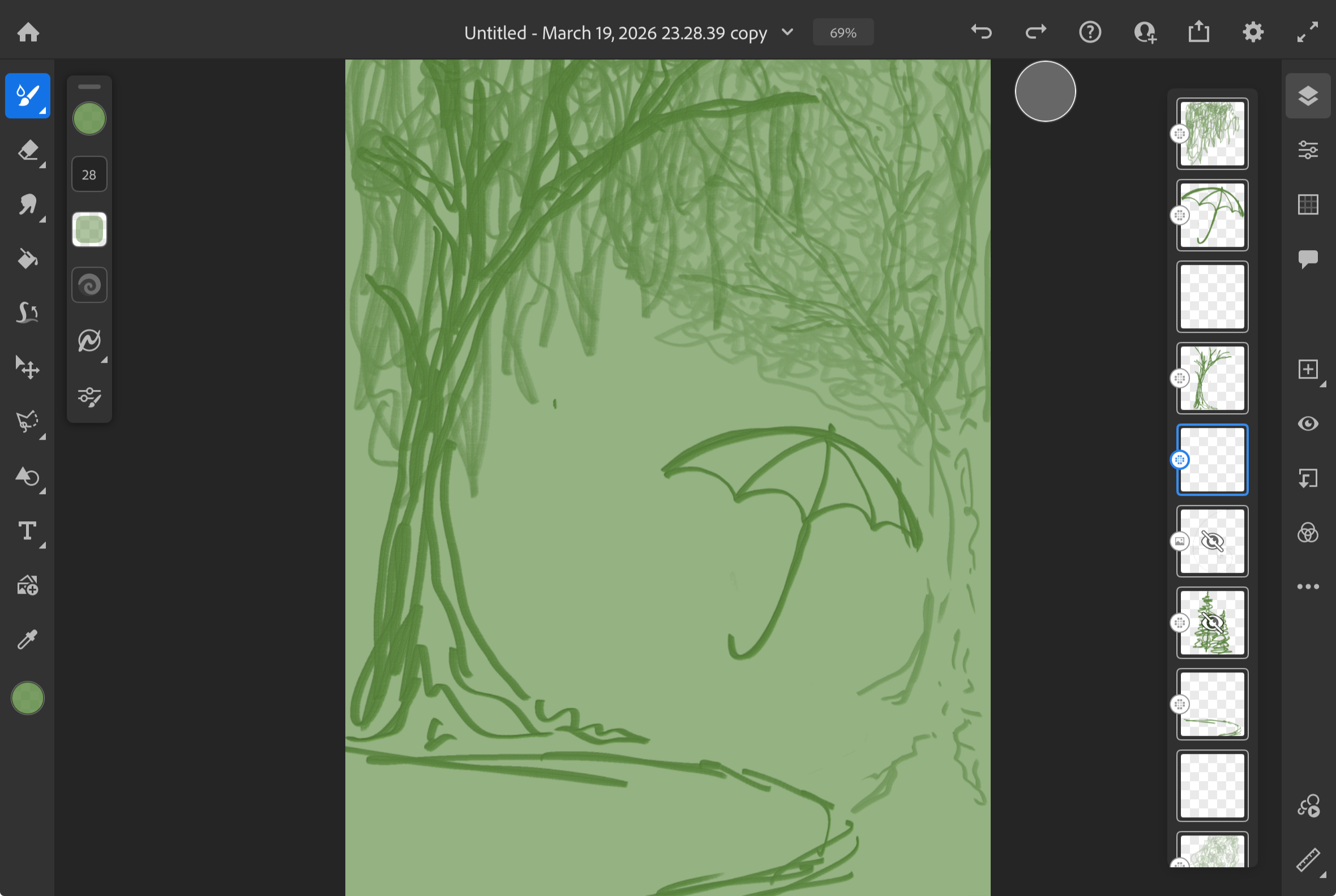
Instead of using an existing piece of his, I painted the entire scene on my iPad in Adobe Fresco. I built the composition around a framed, almost window-like view into the landscape—using the trees to create a natural border and draw the eye inward toward the light and the umbrella. A lot of the process was trial and error, especially in the foliage and water, figuring out how to suggest detail without over- or under-defining it.
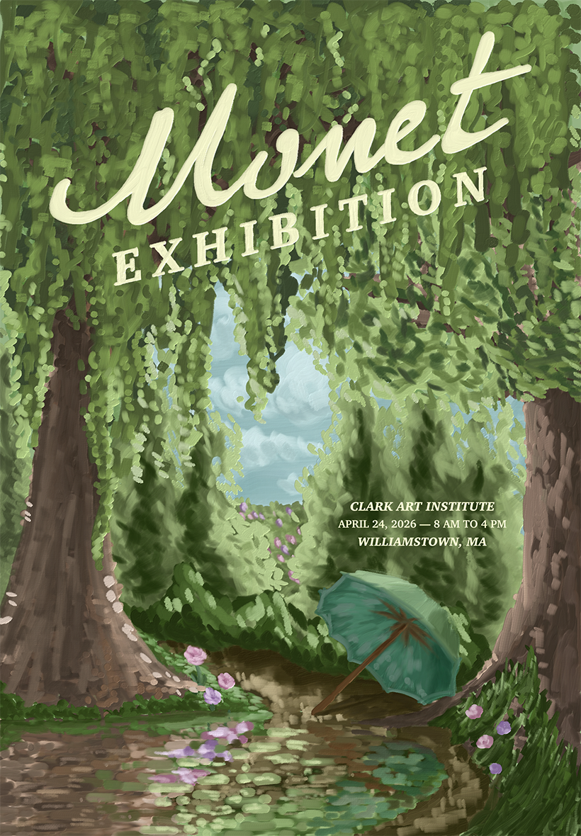
Final event poster
The painting process itself was slow, but it taught me a lot about how Impressionism handles light, how color contrast can replace the need for outlines, and how light/dark contrast can be soft without losing dimension. I spent a lot of time adjusting values and layering brushstrokes to emulate Monet’s style. I’ve always heard it talked about that his work looks chaotic and jumbled up close, and the bigger picture should be truly appreciated from a few steps back. I wanted my “impression” to feel the same.
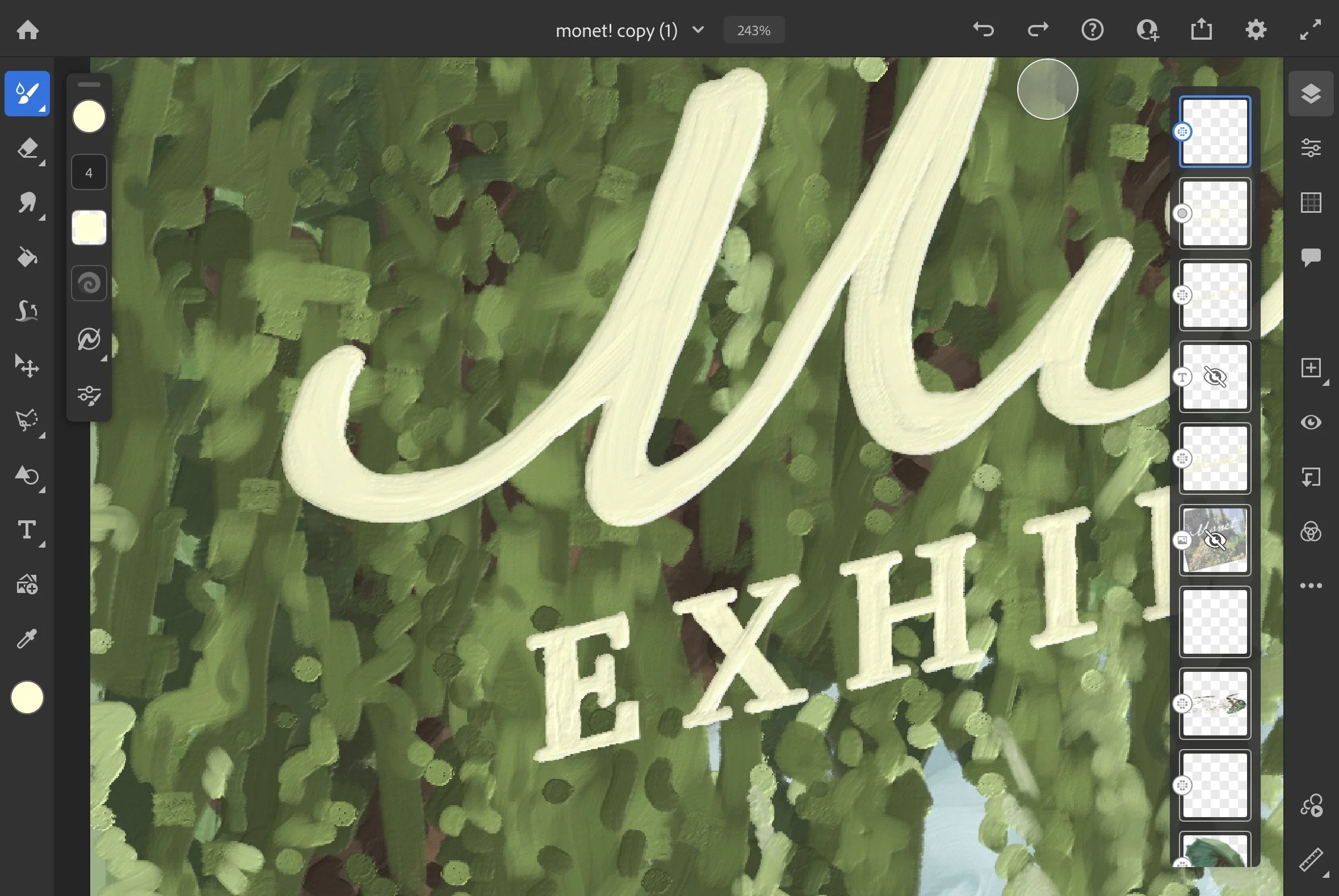
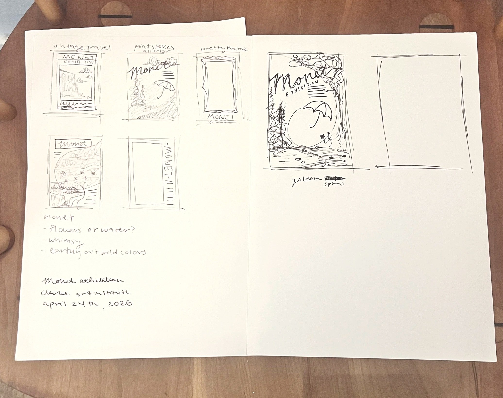
For the typography, I wanted it to feel like it belonged inside the painting rather than sitting on top of it. I used a font inspired by Monet’s signature as a base, then hand-traced it using the same brush as the illustration. That way, the texture and feel of the lettering match the environment, making the whole piece feel more unified.
This project ended up being as much about learning a new way of seeing art as it was about designing a poster. It pushed me to slow down, pay attention to light, shadows, and color, and think more intentionally about how to honor detail in a work like this while still managing time well.