Media Packaging
STCC // GAT-225 - Assignment 3
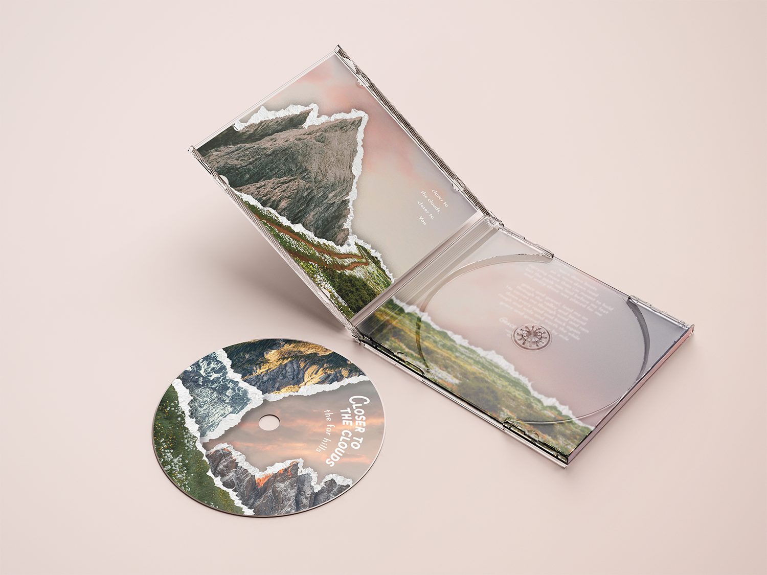
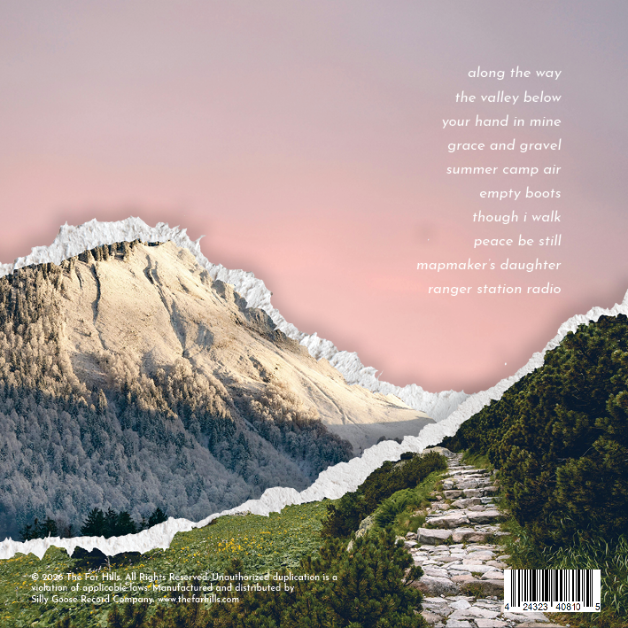
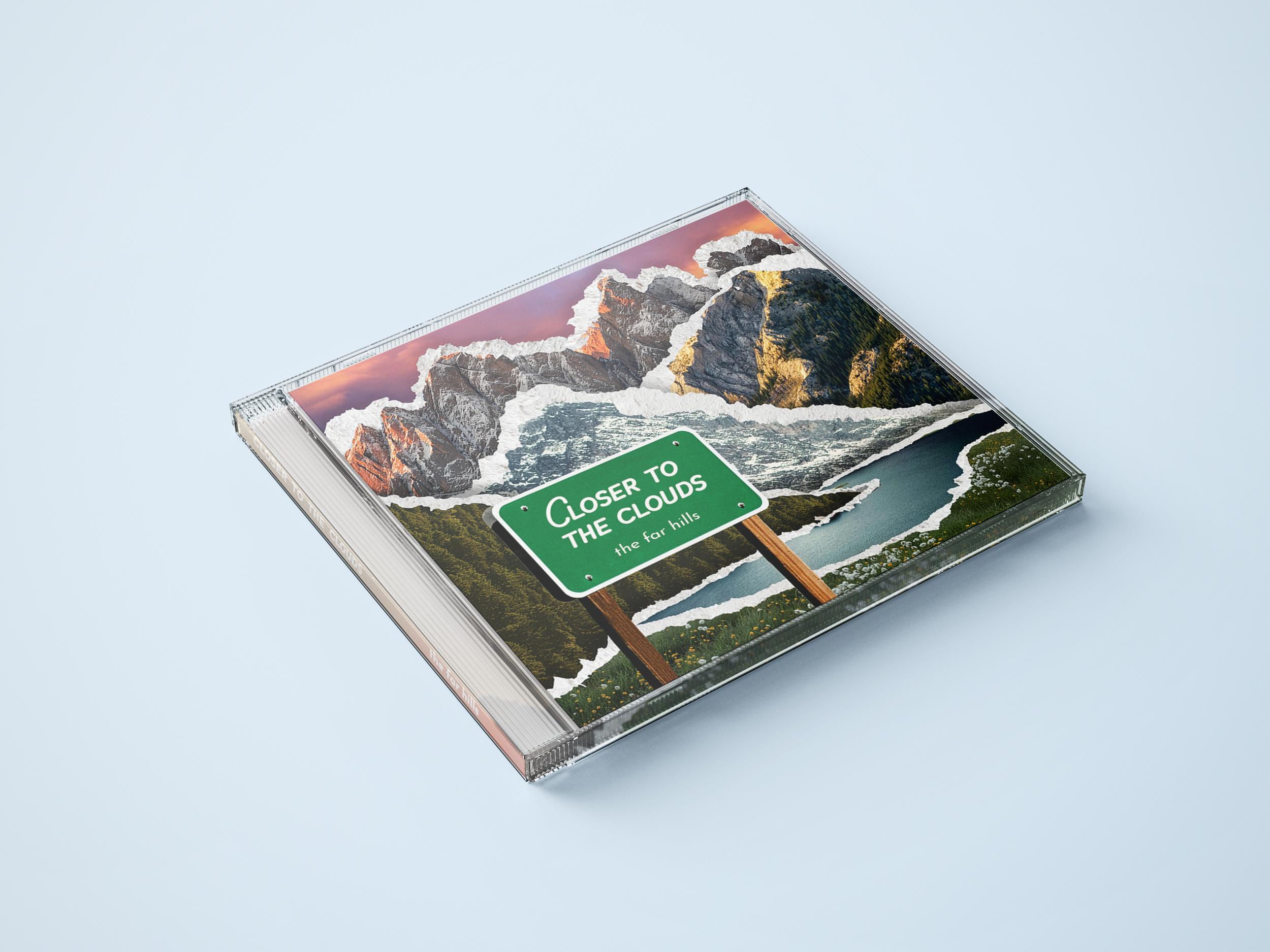
I designed a full CD case layout for a fictional album, building out everything from the front cover to the interior booklet. This was a class assignment designed to teach my classmates and I about creating designs for more complex physical products, specifically media packaging! I wanted it to have enough detail and intrigue that you’d want to keep looking at it, not just put it right away.

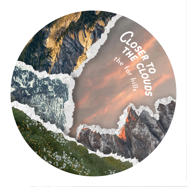
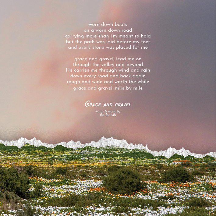
My idea for the “album” was that it would hold themes that align with what I love in my own life, specifically faith, friendship, and nature. I wanted the design to follow those themes naturally.
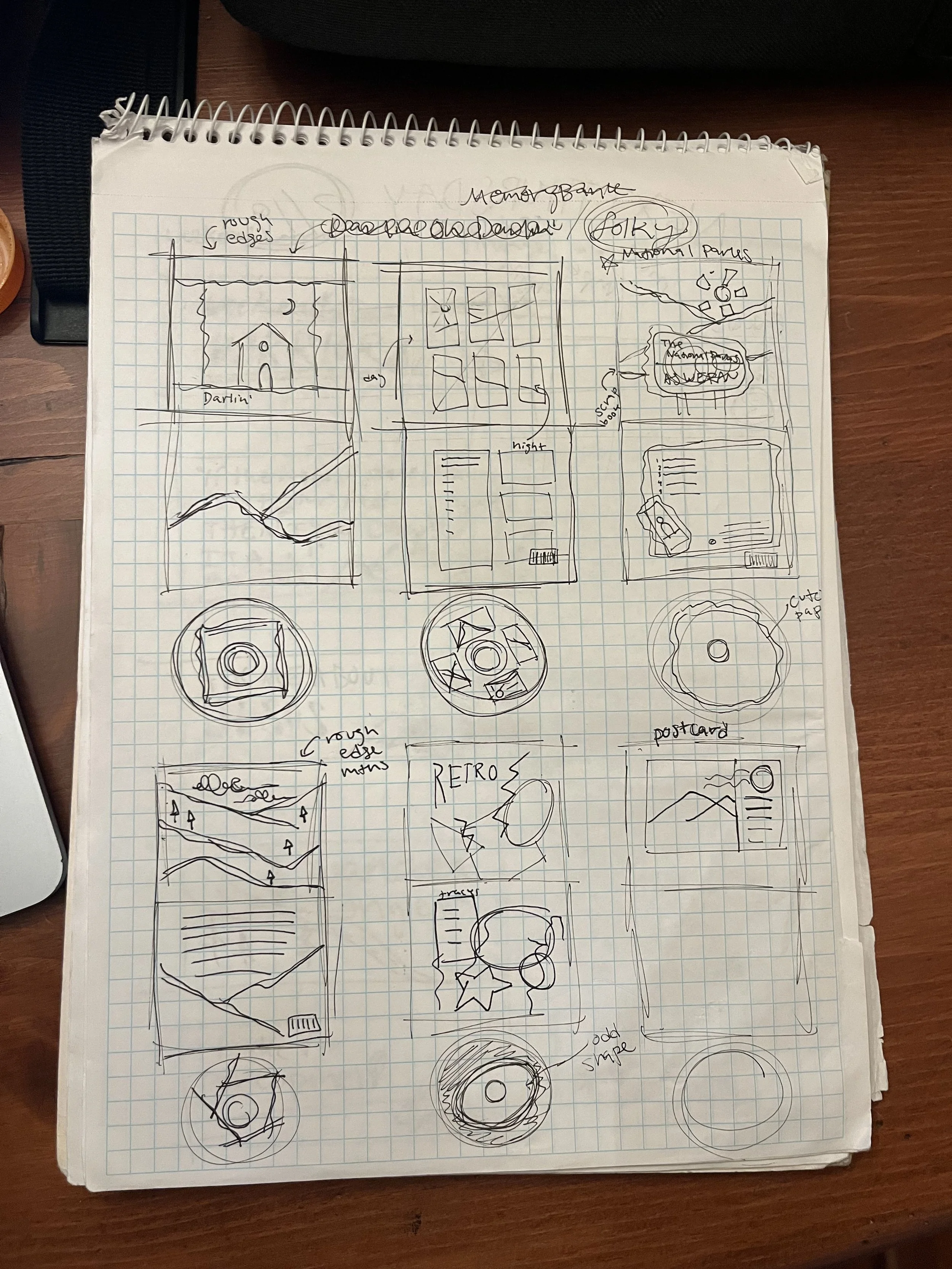
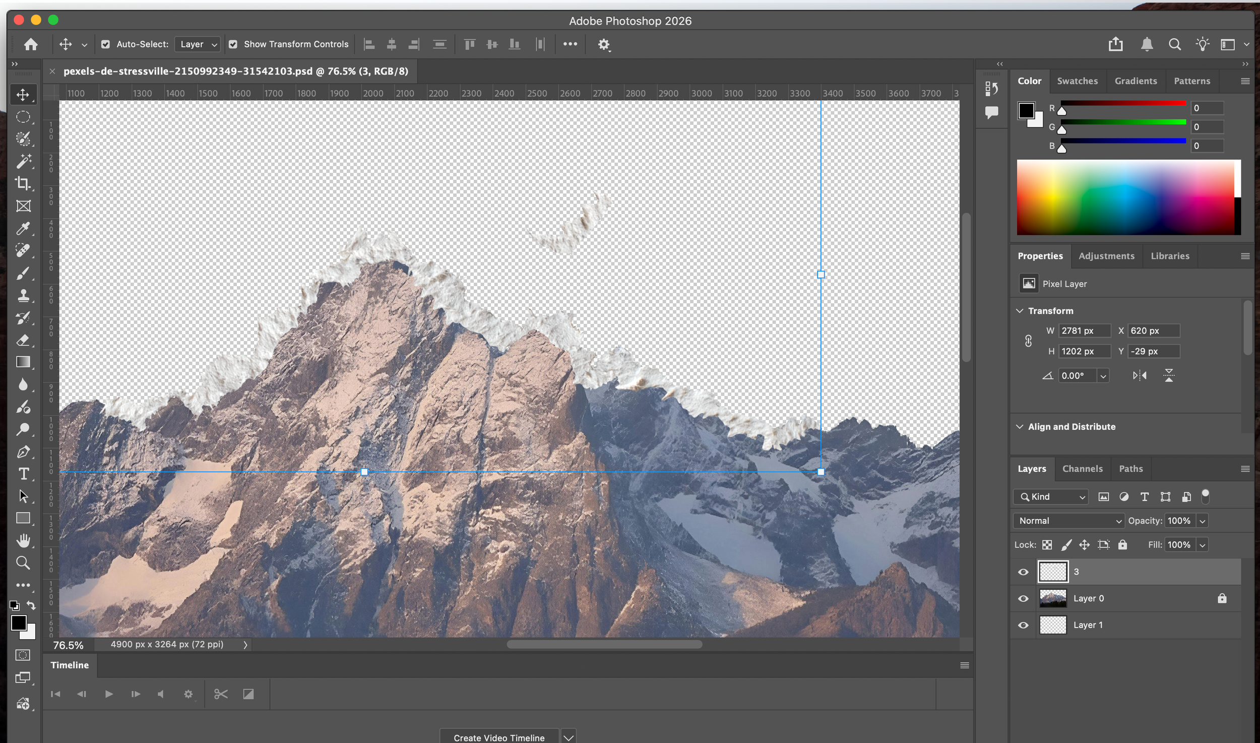
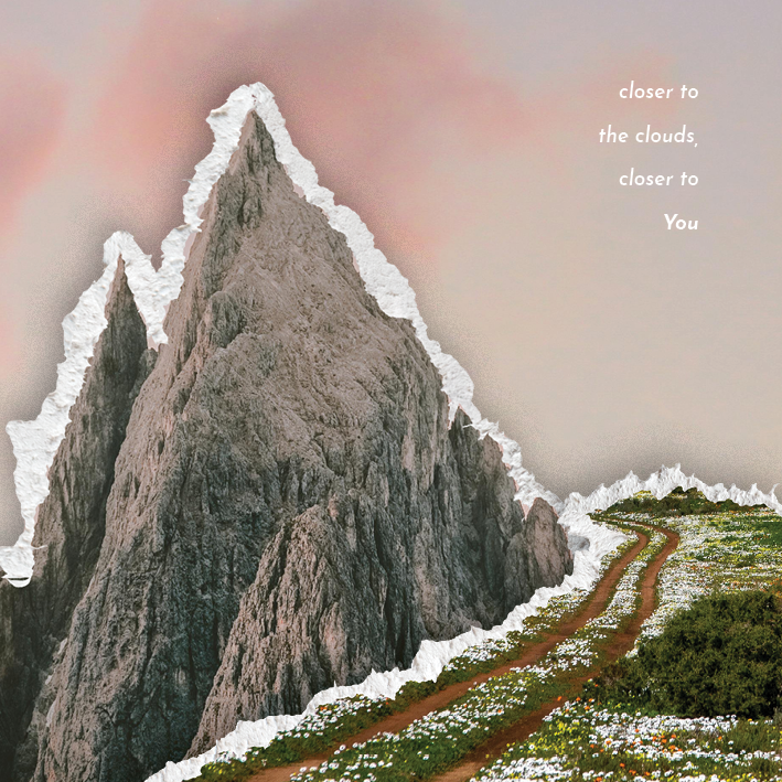
I started with quick sketches to figure out layout and flow, especially how the text would move across different panels. My first step in the digital process was editing the mountains to have the rough paper edge, which took a lot of trial and error. I spent a lot of time adjusting spacing, alignment, and scale to make sure the “scrap mountains” felt cohesive when the case is opened and handled, not just when it’s viewed flat on a screen.
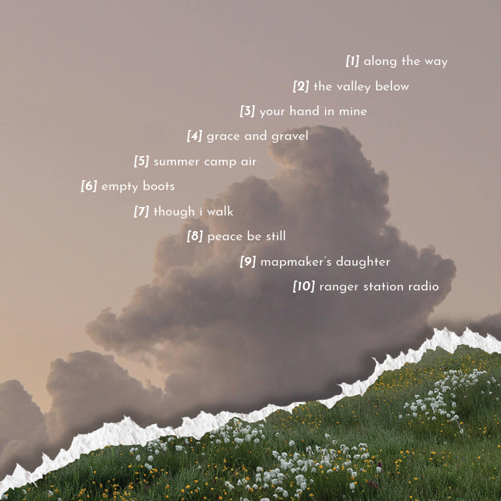
Typography was a big focus for me here. I wanted it to feel intentional but not distracting. Clear enough to guide you through track listings and lyrics, but still aligned with the tone of the album and the feel of the designs I had already created.
This was such a fun project that taught me a lot about working with designs that span more than one page!