Bumper Sticker

Final sticker
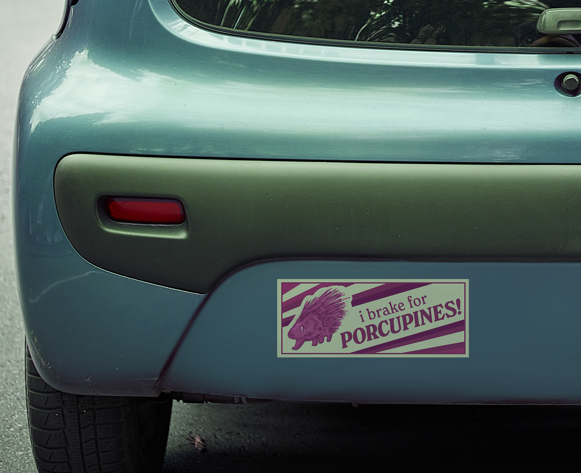
STCC // GAT-225 - Assignment 2
My classmates and I were challenged with this assignment to each create a design for a bumper sticker that applied the basic Principles and Elements of design, effectively displayed a message, and would work functionally as a real bumper sticker.
Some of the challenges with creating stickers at this scale are ensuring that the text is legible from a distance and making sure that the viewer’s eyes fall towards the main message of the design, typically the words or the main motif.
The story behind this sticker is that I built up a reputation in the community I live in for hitting 2 porcupines with my car on the same stretch of road in a span of 6 months. Yikes!
In the sketching phase, I had plenty of ideas for stickers, but I ended up picking this one based on feedback from classmates and other peers outside of the classroom.
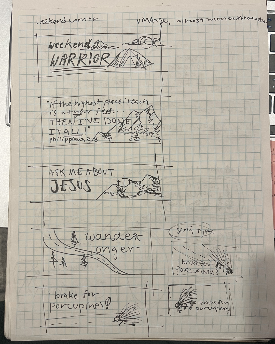
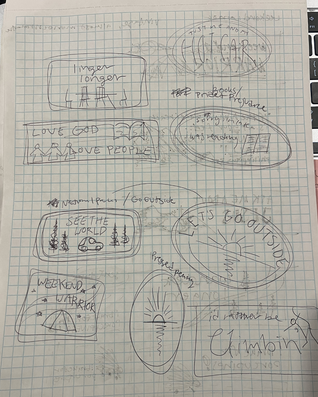
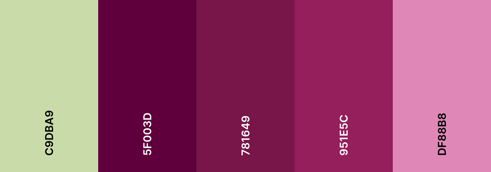
During my prep and research processes for this assignment, I was inspired by a lot of vintage-y stickers. Specifically, a few with reverse text (light text, dark background) or distinct, bold color schemes. Through feedback from my classmates and professor, I decided against the reverse text idea to ensure that the final sticker would be easy to read.
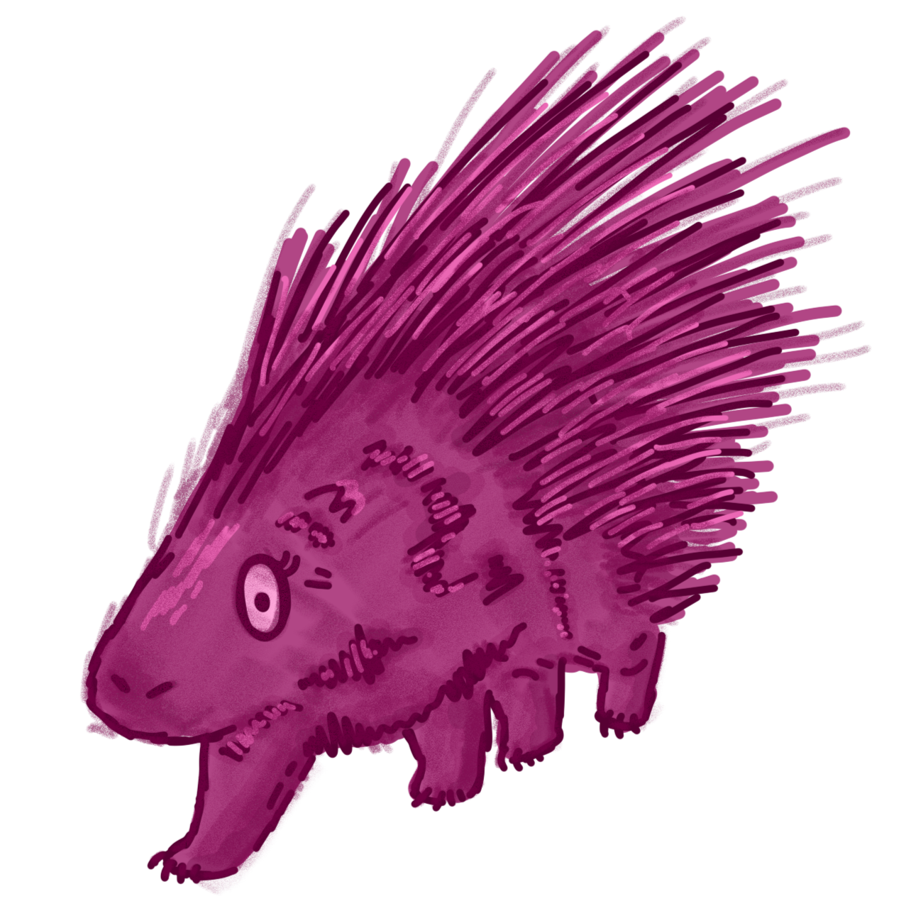
I created the porcupine motif in Adobe Fresco, with a lot of trial and error. Here’s the final porcupine and the sketch that I worked with to create it!

In my final stretch of work on this project, I dropped the text and motif into Adobe InDesign and worked through a few different layout options. My original sketch involved the porcupine standing on a road, but I ended up filling that gap with the stripes instead. The stripes allowed me to keep it simple, not distracting from the main motif and text element.
Mockup courtesy of MockupDen